Getting an AI stylist app out of its own way.
Recently, I worked on an AI powered fashion styling app that reduces decision fatigue and builds personalized wardrobes curated on the user's physical attributes. The recommendation engine was their core value proposition. Users had to complete several steps before they even knew what they would get.
A consumer app plays by different rules
Most of my experience is in enterprise SaaS and healthcare where users are trained, and won't leave a workflow because a screen annoyed them. But, for consumer apps, this is the opposite. People download it on a whim and get rid of it after just one minute if they're not satisfied. In enterprise I am reducing error and cognitive load across a long session. Here I had to shorten the distance to the first useful output, make the app less overwhelming and get the user to open it again. Here's how the app worked.
Create an Account
Create an account using email and password or signup with a social media account.
Style Assessment
Complete style assessment by providing body type and preference information
Get Recommendations
Receive wardrobe recommendations curated and personalized based on physical attributes.
Virtual Try-on
Create AI generated image of yourself with the selected wardrobe and shop directly with in the app.
What I found before
I changed anything
I went through the full design as a new user and noted every issue, the stage of the journey it damaged and its rank based on it's likely impact on activation and conversion. I also worked with the iOS and Android devs to make informed decisions based on tech stack limitations. A high-level review of the app's onboarding process and features compared to other similar apps revealed these issues,
- Delayed time to value. It took too long to get to the good stuff, the app asked for a lot of personal info before it showed you what you'd be getting.
- Hard to discover features. It was hard to figure out what features were available, the app didn't make it clear that you could choose between traditional Indian and Western-style clothes.
- Low transparency. People didn't know how the app made its recommendations or how their input affected the suggested outfits.
GoalRedesign the app to reduce cognitive load, improving feature discoverability, and making personalization more transparent throughout the app.
Onboarding and sign in
A new user was asked to register, verify, and then describe themselves before they even knew what the app was about or what they'd get from using it.
First explain what the app does and then have the user sign in with their social media account, which covers most of the registration details. Shorten the distance to first recommendation by collecting only the minimal info required for the styling engine.
Four decisions inside the assessment
The assessment asks for your skin tone, face and body type, all of which affect the recommendations. But if the answers are incorrect, the app will still give bad advice and you'll never know why. So, I worked on four key parts of this section.
Old UITwo routes given equal weight, so the first decision is about how to answer rather than answering.
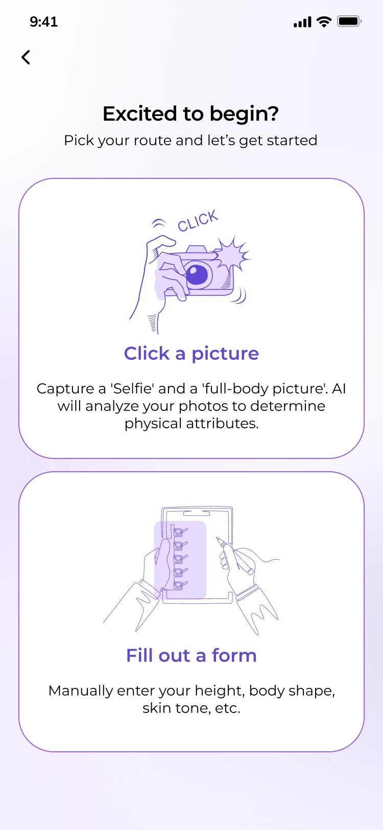
New UIOne route leads. Entering details by hand is still there, one line down, for anyone who wants it.
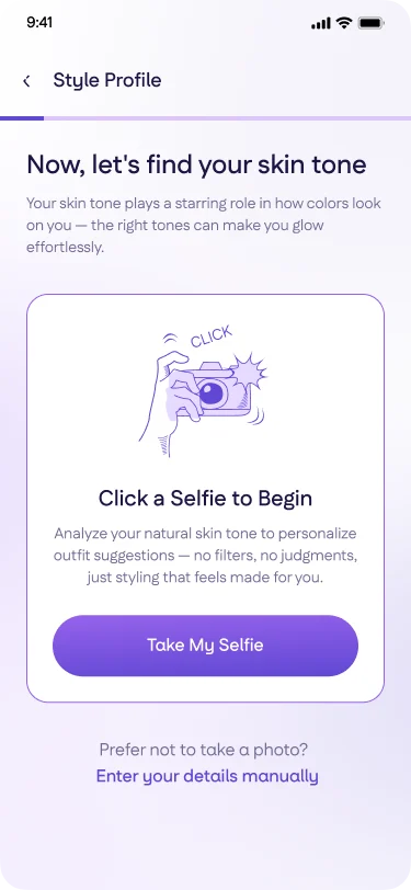
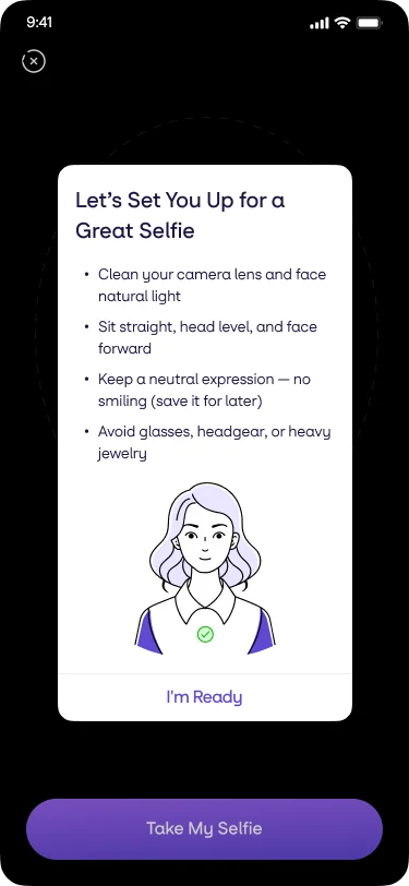
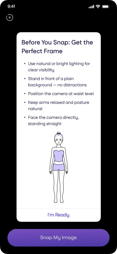
Old UIEight rules before the selfie and five more before the full body shot, written like a passport photo checklist.
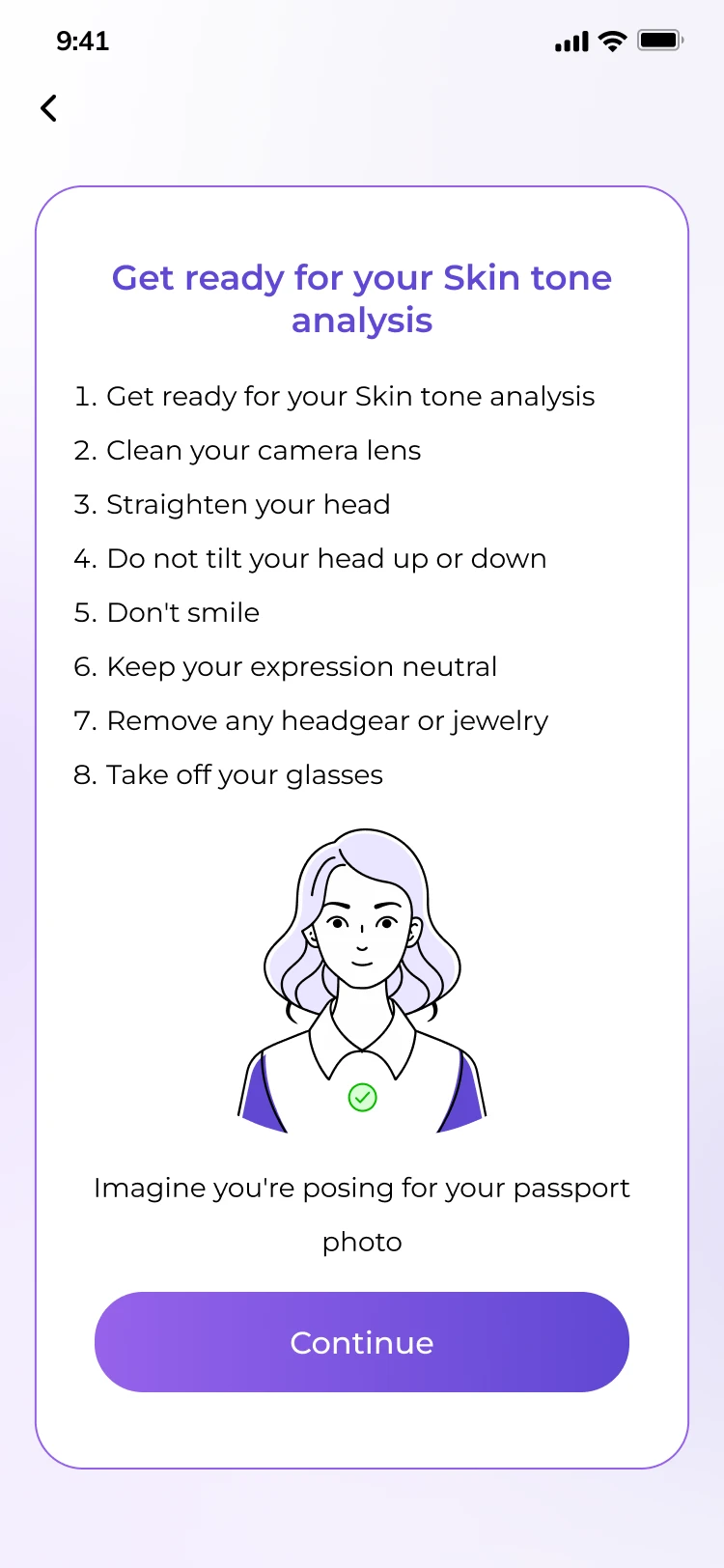
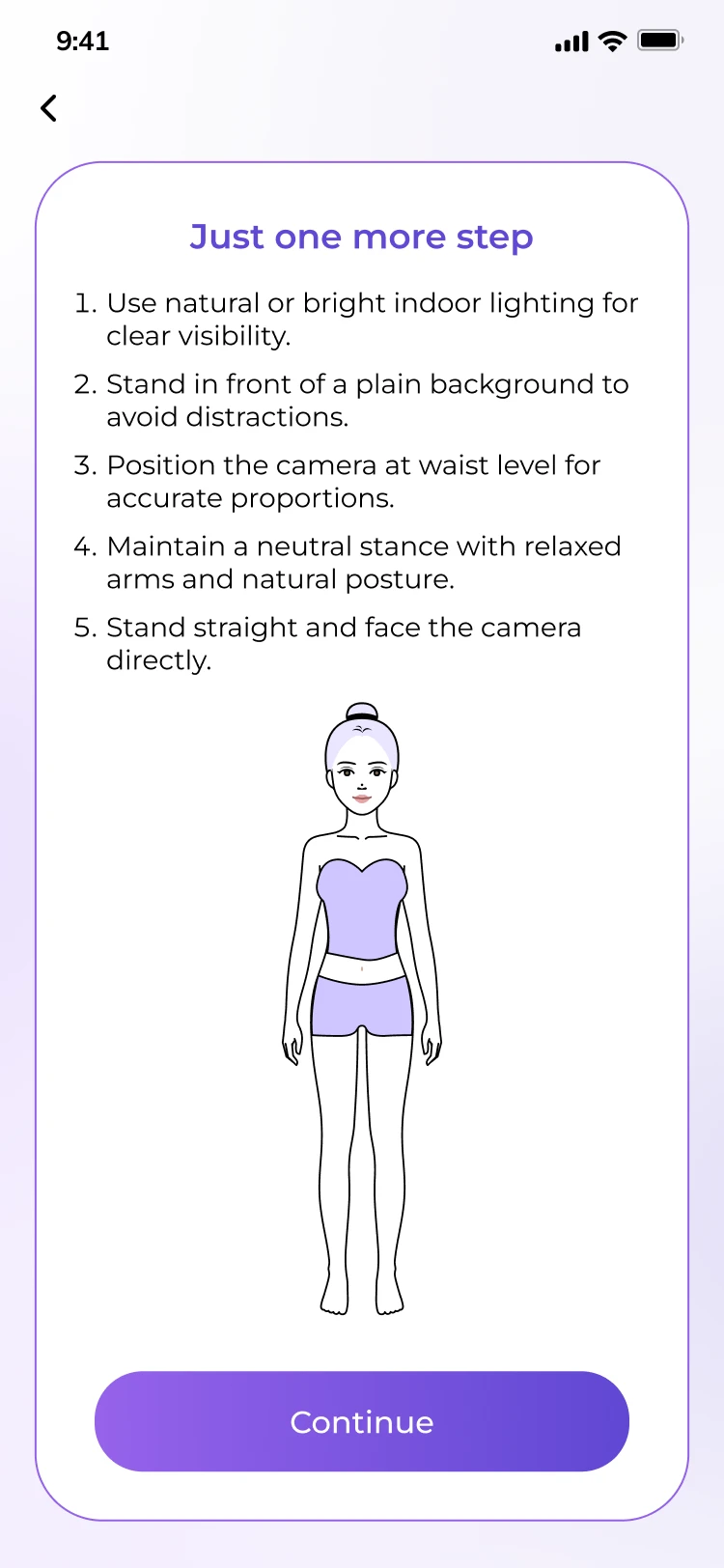
New UIStill two screens. The wording turned into help rather than requirements, and it sits on the camera where the photo is taken.
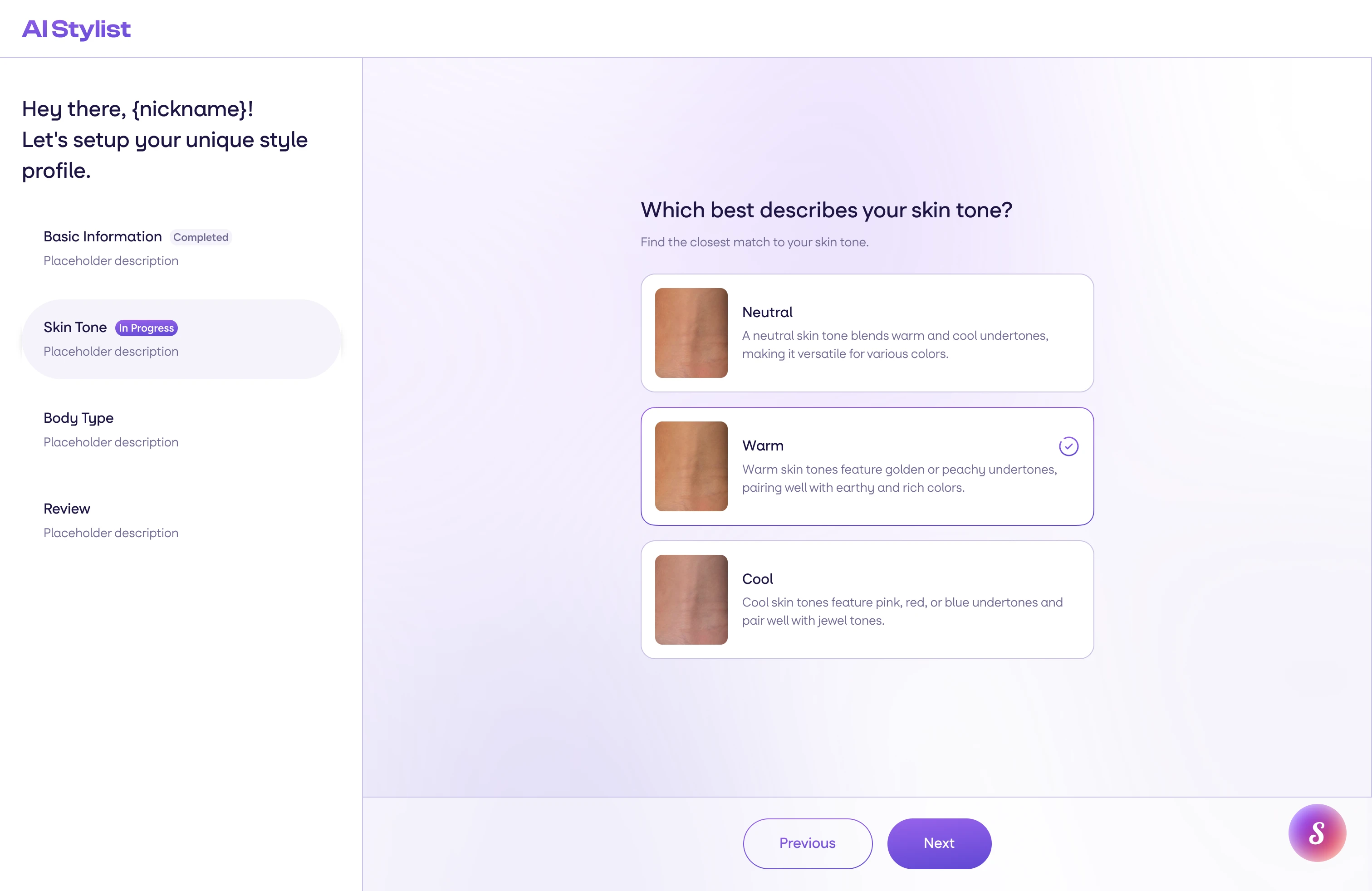
Old UIEach definition sat behind its own info icon, one popup at a time, so choosing became a memory test.
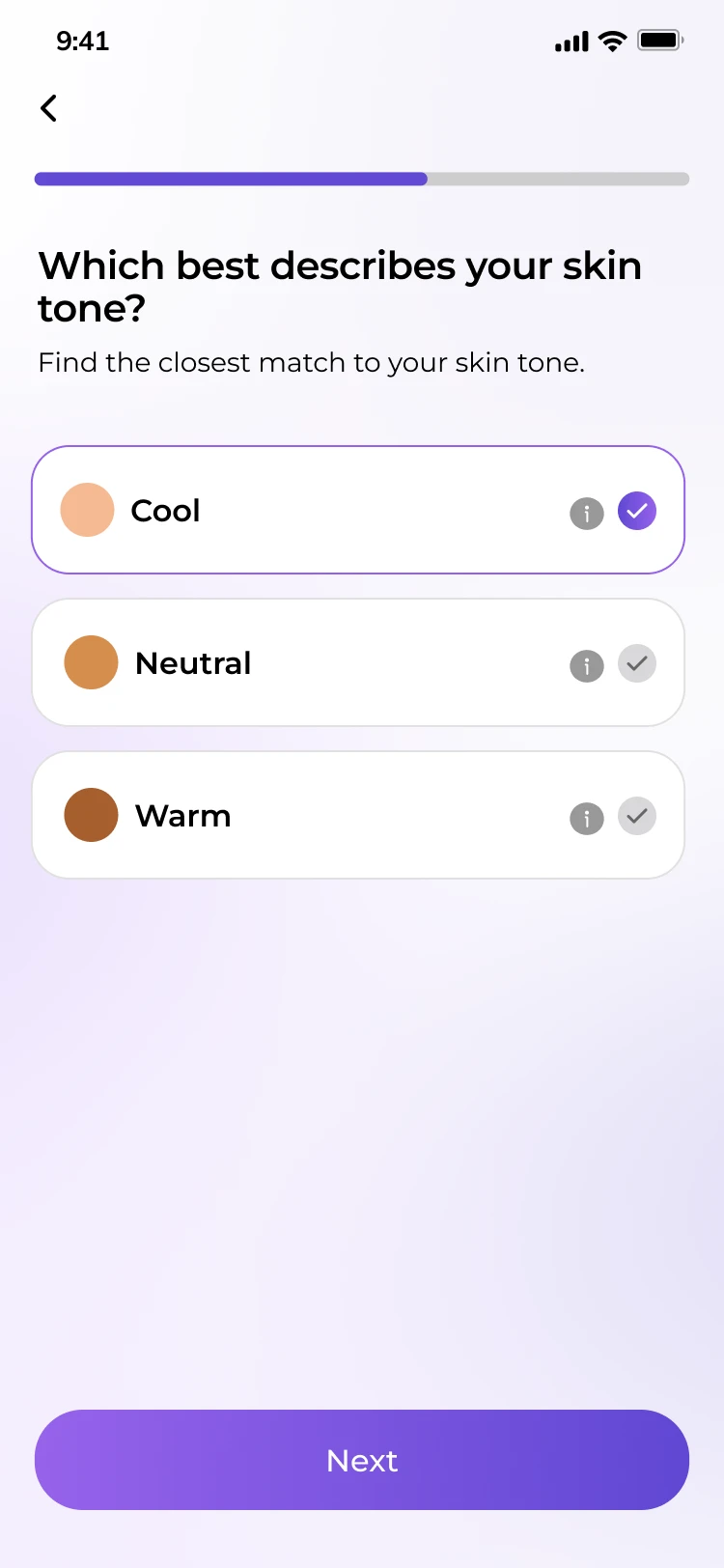
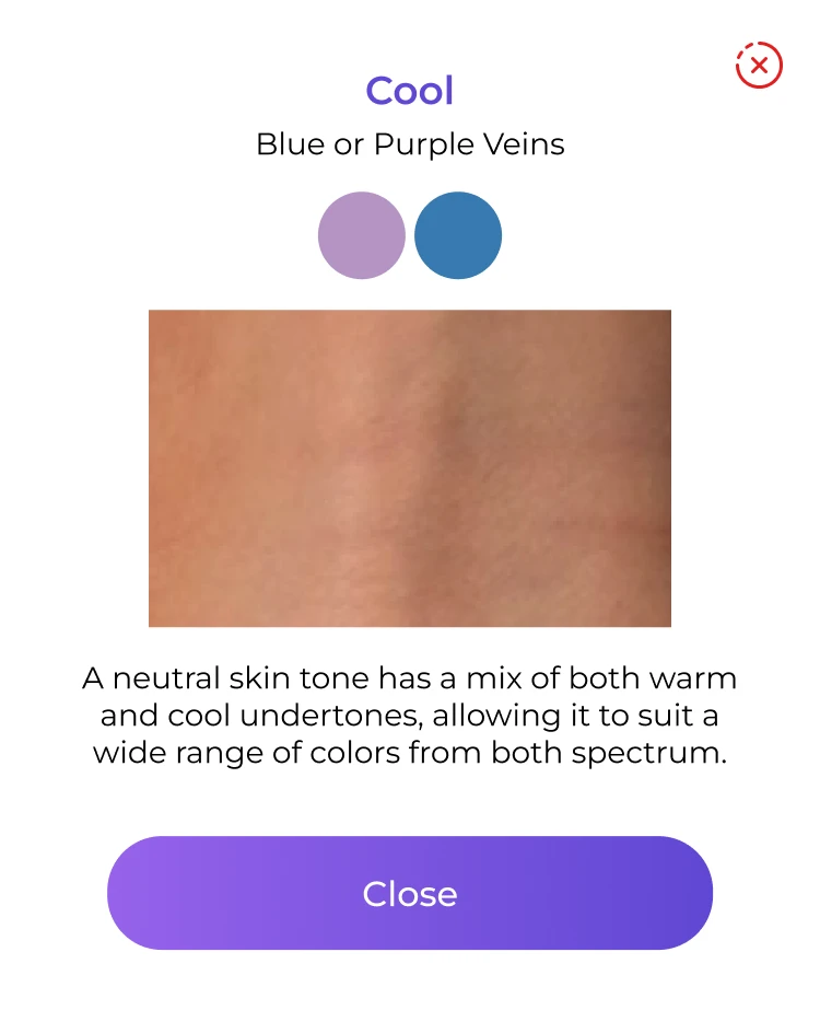
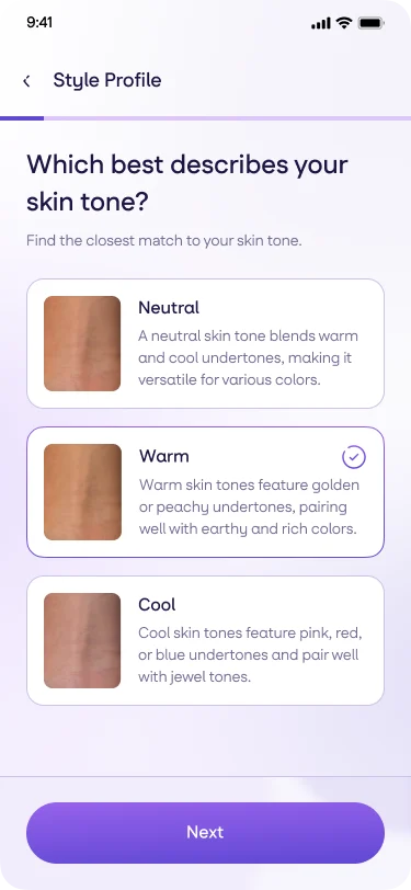
New UIEvery description visible at once, beside its swatch, so the choice becomes a comparison.
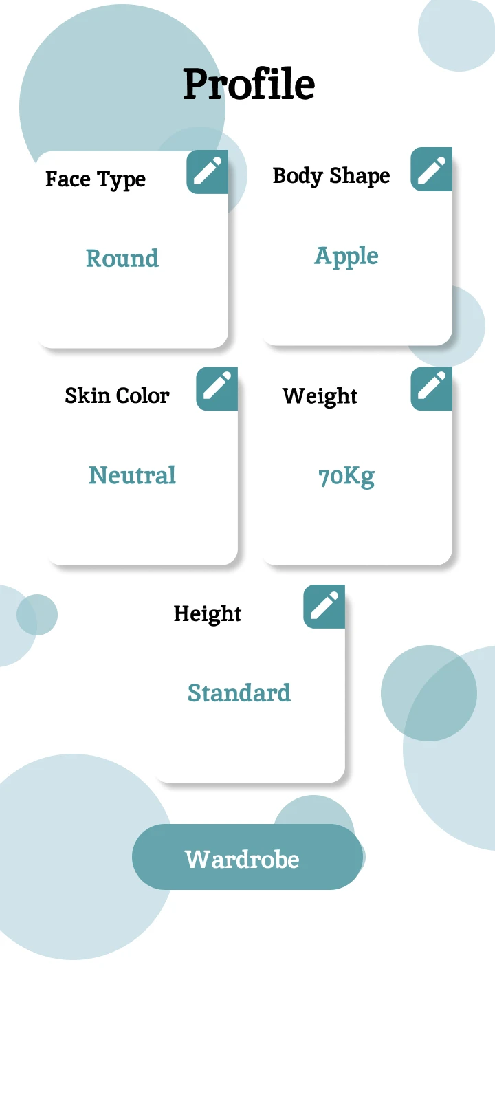
Old UIThe result read as a submitted form, in a visual language belonging to no other screen in the app.
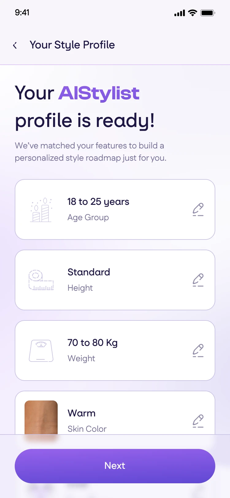
New UIThe same data presented as the beginning of something, in the language of the rest of the app.
Payment flow
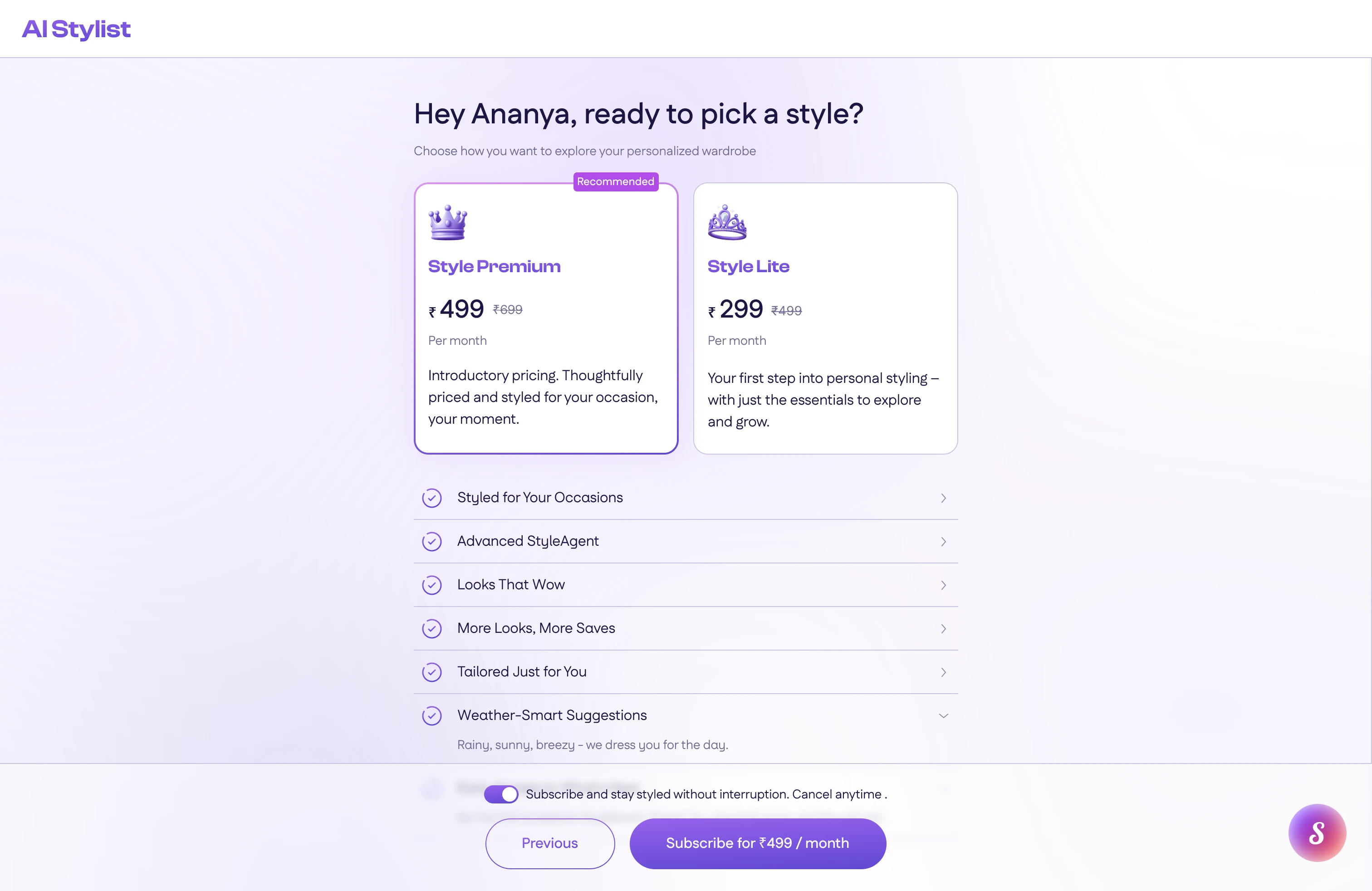
Subscription was presented as an add-on feature after the assessment, which wasn't a great sales pitch.
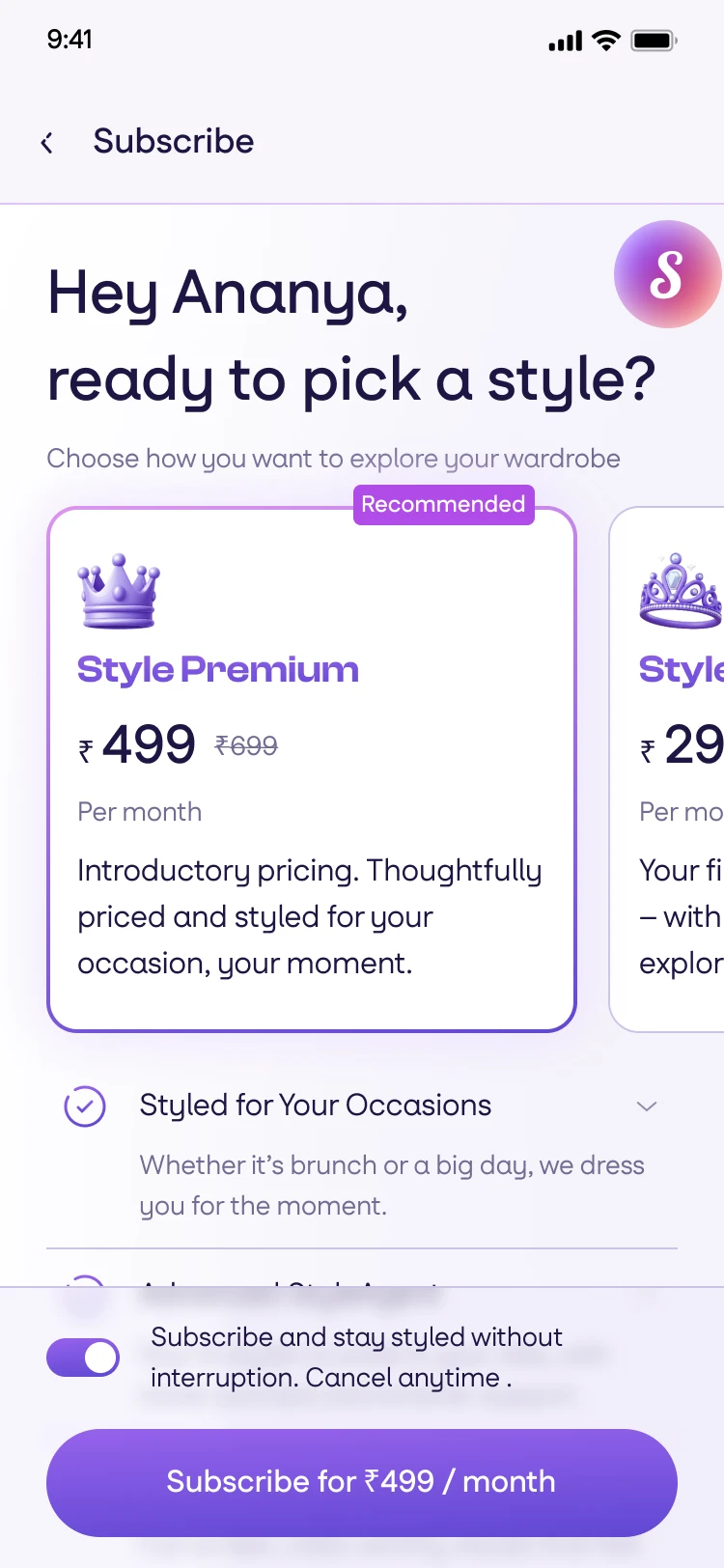
Completing the assessment is a milestone in itself, and that's when the user is more likely to be willing to pay. This was a big bet, and I recommended we test it.
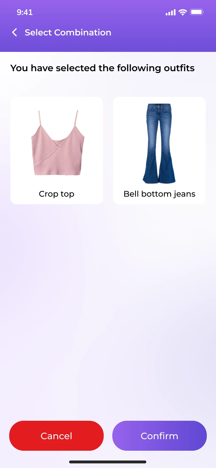
Old UINine screens into the outfit flow, confirming the outfit raises a sheet. Two prices for the same unnamed thing, and nothing yet to want it for.
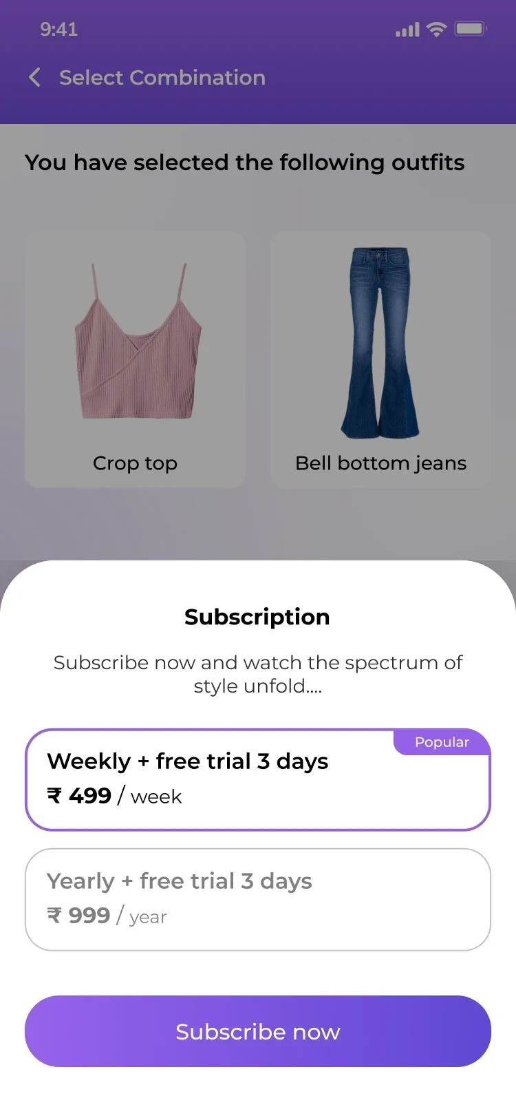
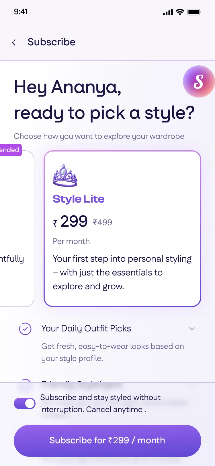
New UIStraight after the assessment result, where the value has just been shown. Two named plans, priced against each other, with what each buys listed under them.
Landing page and plan outfit
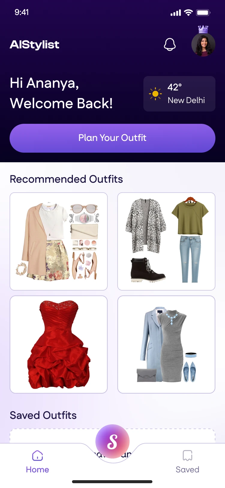
When the app opened, I'd see an empty wardrobe, which didn't help me understand what the app did. When planning the outfit, there was no sense of how much you'd accomplished or what was left to do, and you had to answer questions that you already answered.
I changed this with a dashboard that gives you a clear place to start. There's recommended styled outfits that you can look through or use the prominently placed CTA for a fresh new start. I also added a checklist to outfit choosing part to show the status, what's missing and what's coming up. I also removed the extra filters as they accomplished
Sia
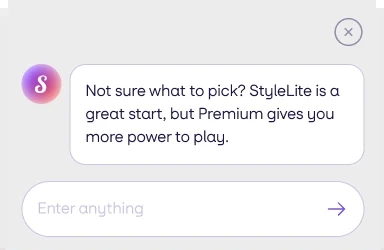
The client wanted an in app assistant. I defined and designed how it should behave when nobody was talking to it.
Newer AI assistants interrupt the flow and sit open all the time. I think AI should be a silent spectator but should help when I'm stuck. So Sia stays closed, with a badge that glows when she has something to offer. She appears on her own when someone is stuck or spending too long on a single screen, like good old Clippy from old MS Word but more helpful and less annoying. How long before she appears was the tricky part. No, not based on a timer, it quickly becomes boring within 2 sessions. So the trigger is hesitation and not elapsed time.
Lookbook
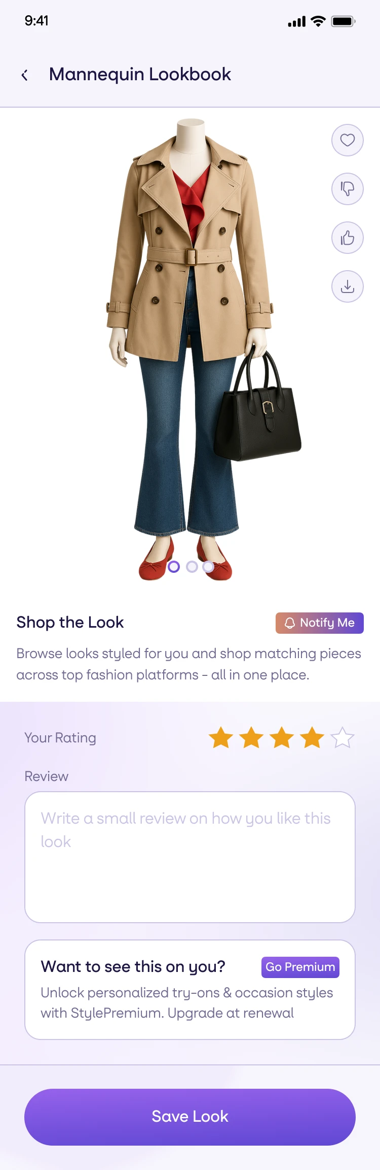
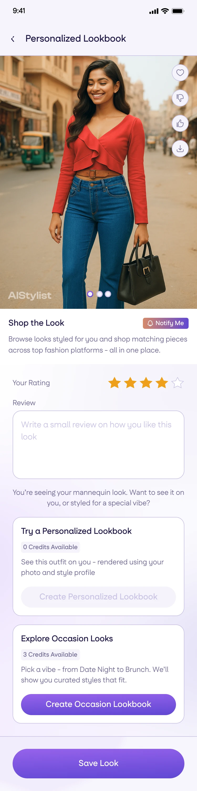
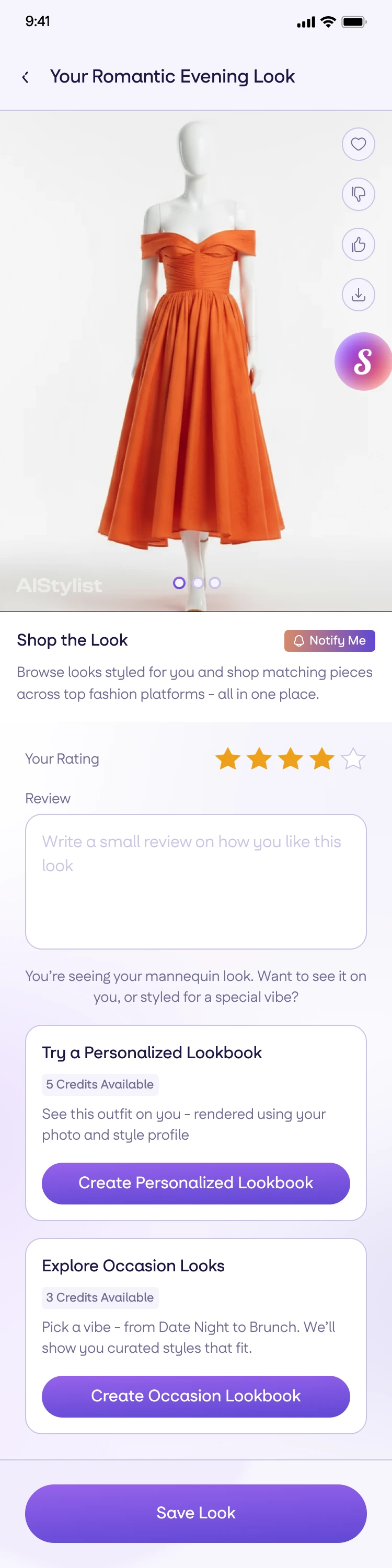
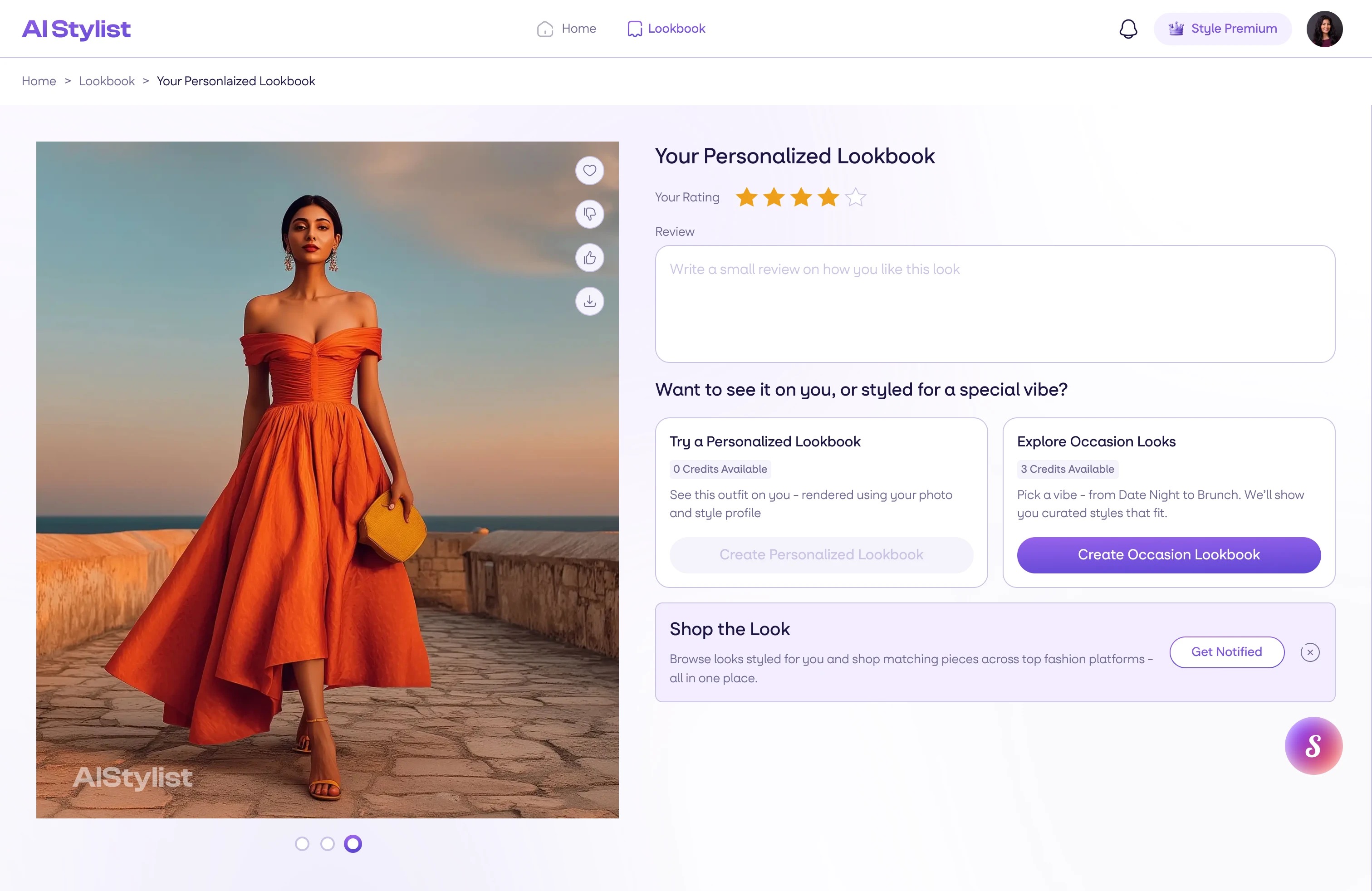
The lookbook is where the user gets to see what the AI has created for them. There was nothing but a placeholder for me to start with. After doing some research and discussion with the client, I suggested a simple lookbook page with an upsell card for StyleLite members and options for personalized and occasion looks for StylePremium. Since the user will already be looking at their own generated outfit, they'll understand what the upgrade will give them.
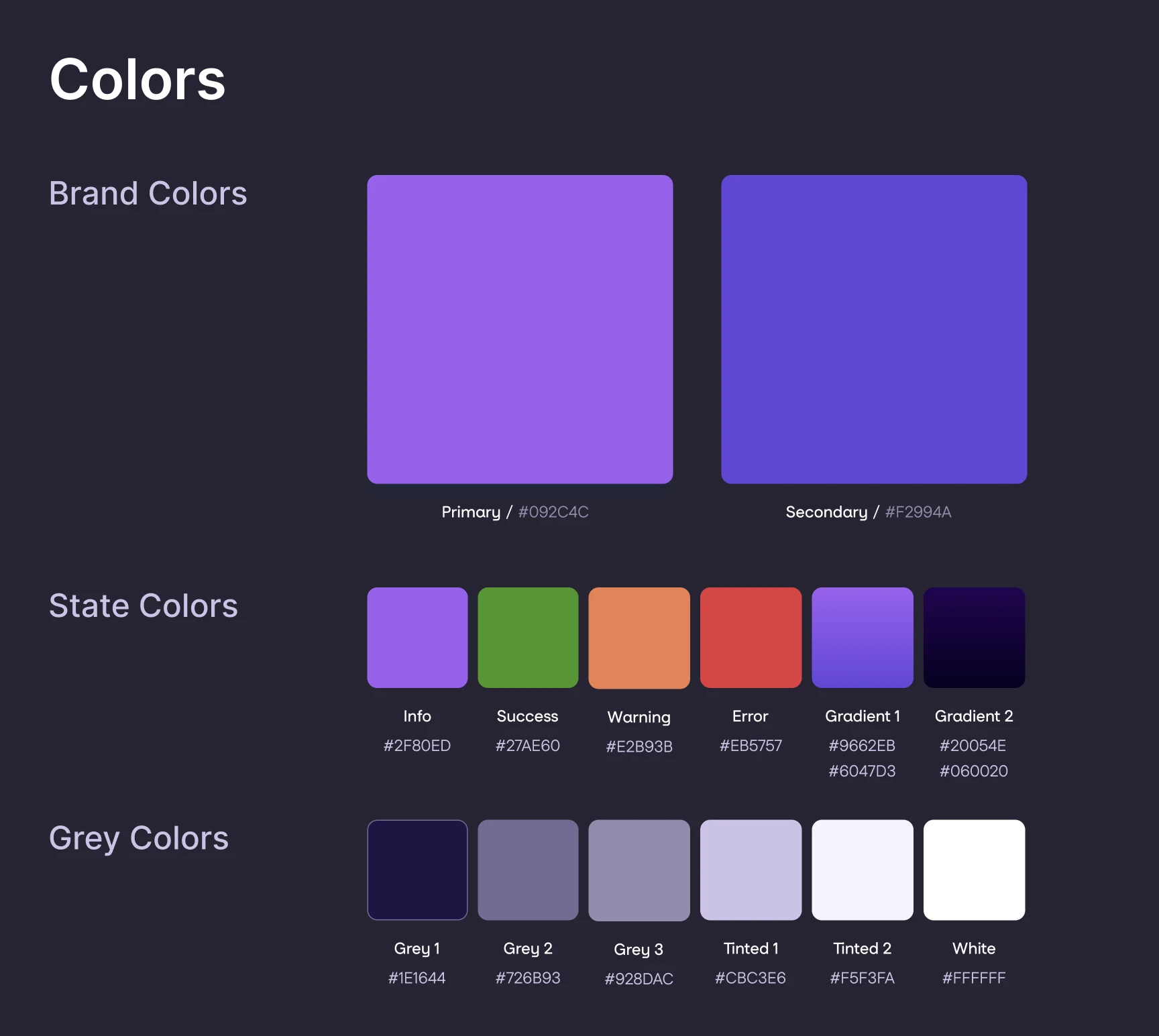
Web experience and dark mode
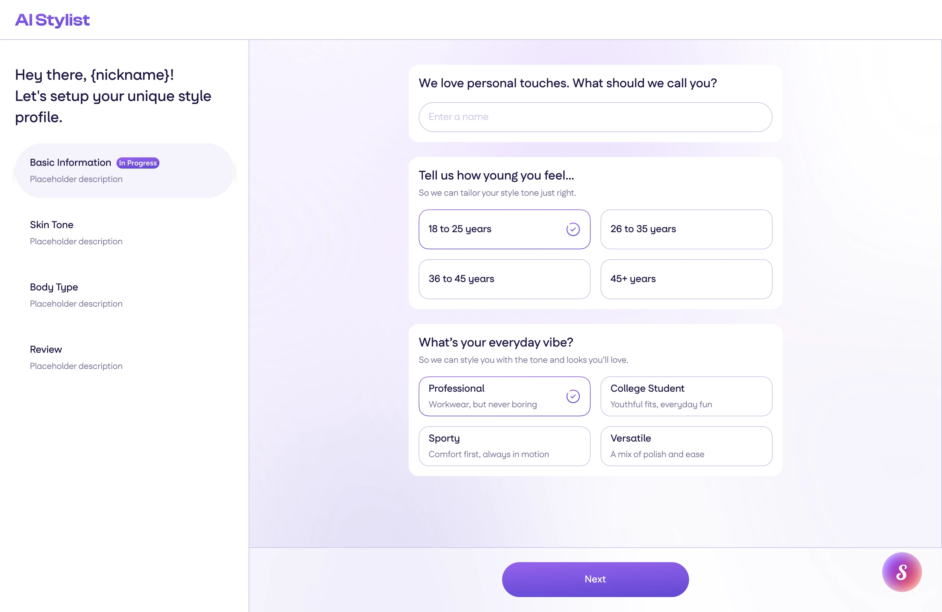
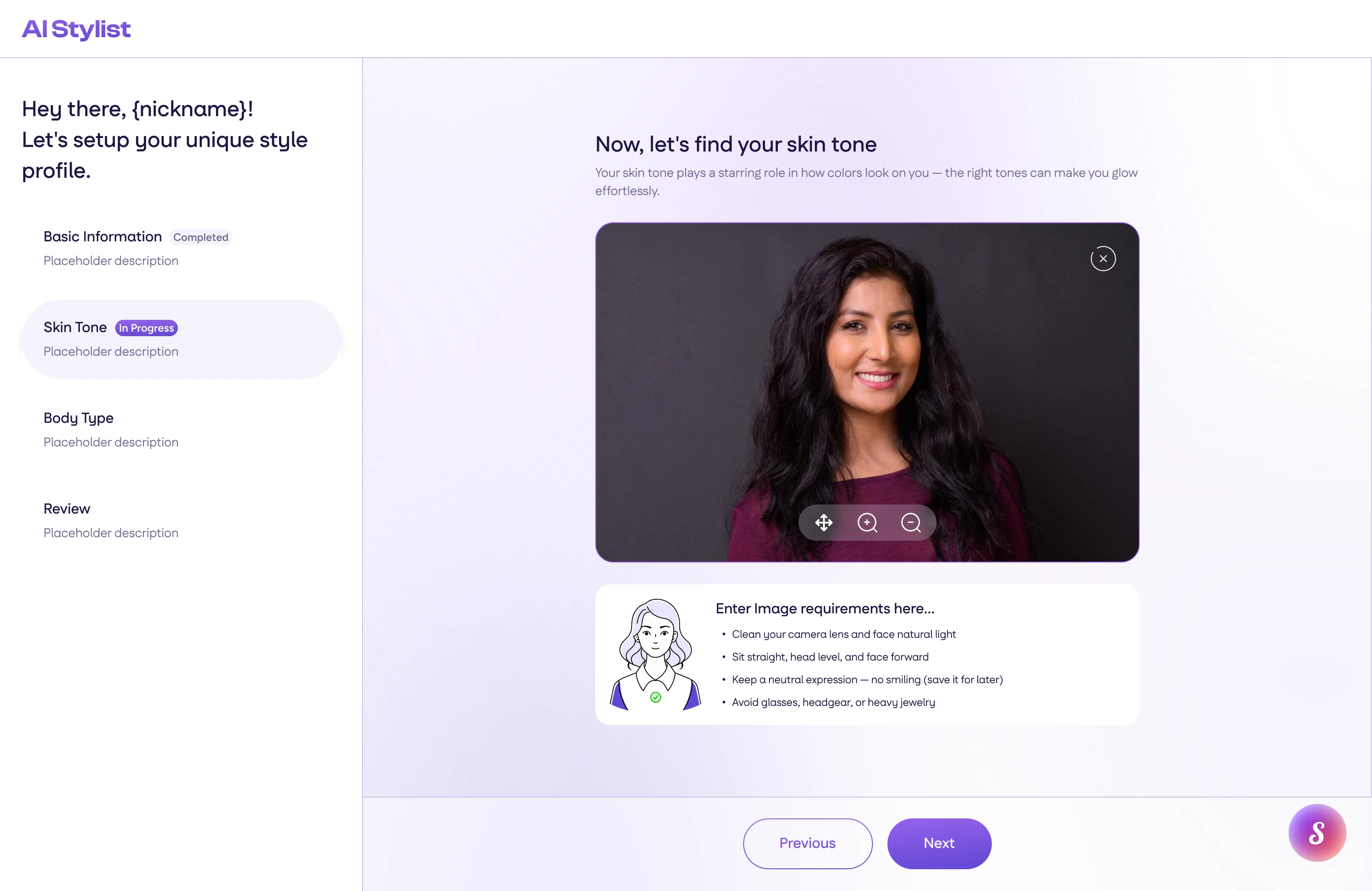
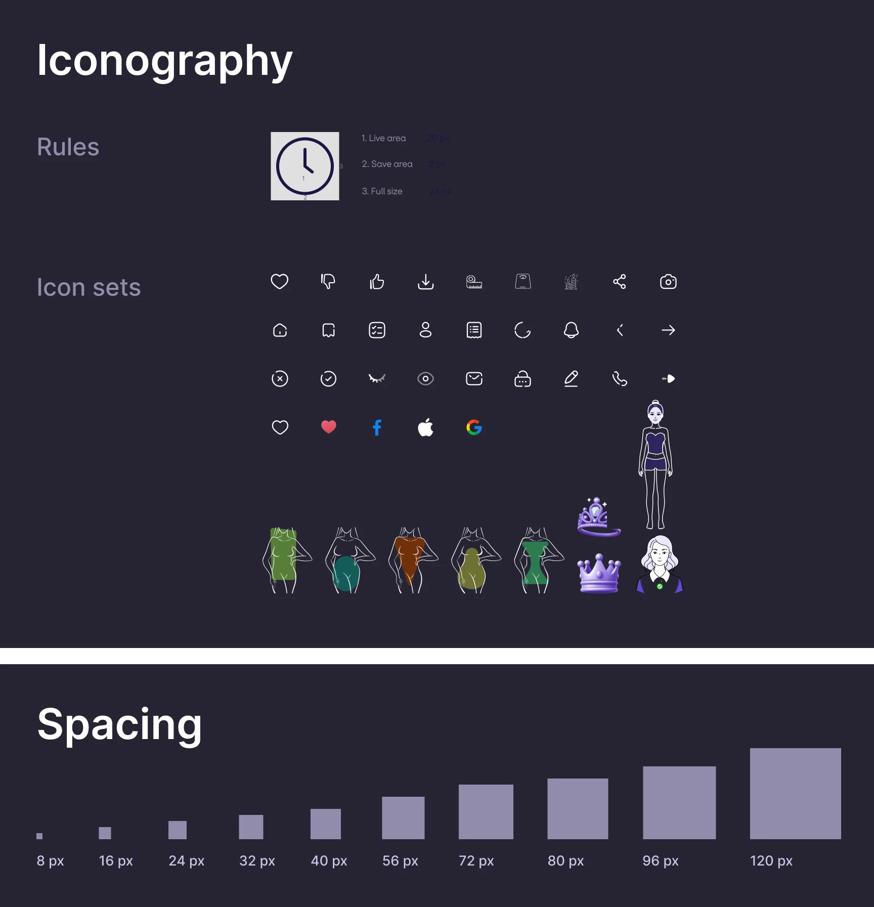
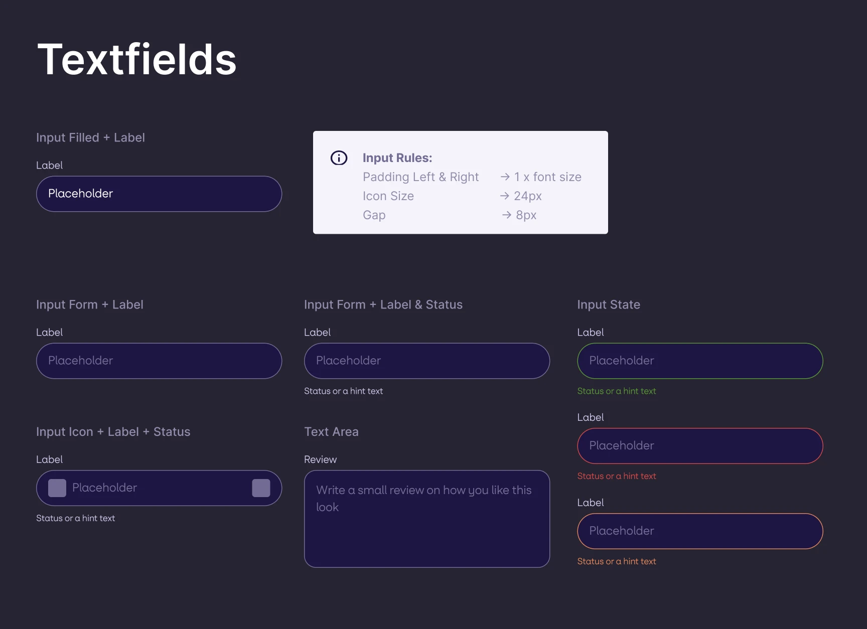
Originally, the app only had a mobile version. We needed a way for the users to access it on web without installing an app. I adapted the mobile designs with a better optimized layout for bigger screens, while keeping the core of the app the same. I also added a dark mode, but had to be careful with the images and accessories that might not work well in the dark. I create a total of 108 screens split across both themes, covering account, style assessment, payment, the outfit flow, lookbooks and settings.
I made sure the overall experience, color scheme, and usability remained the same as the rest of the app. It follows the system theme by default and keeps a manual override in profile.
Rules written as ratios
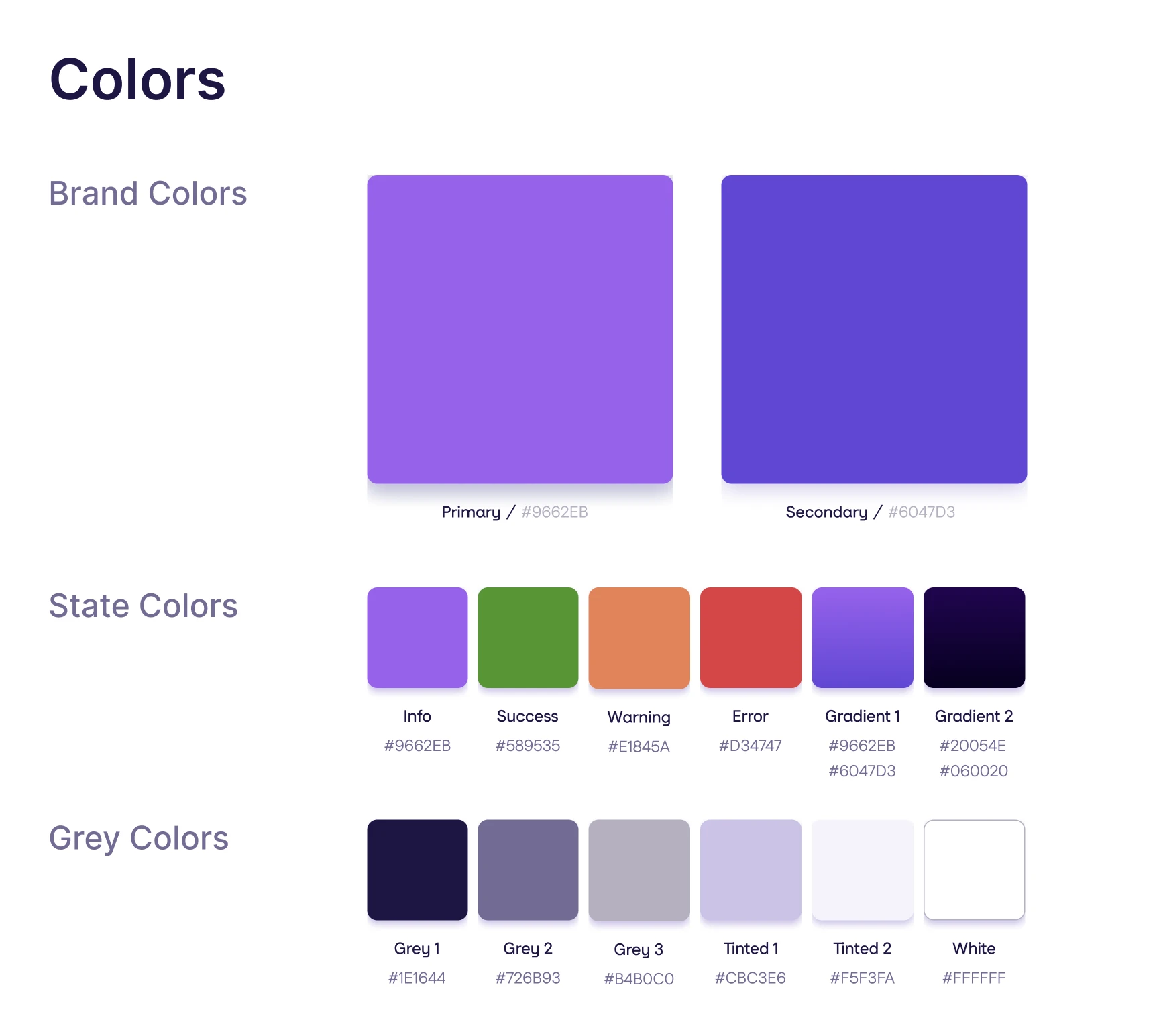
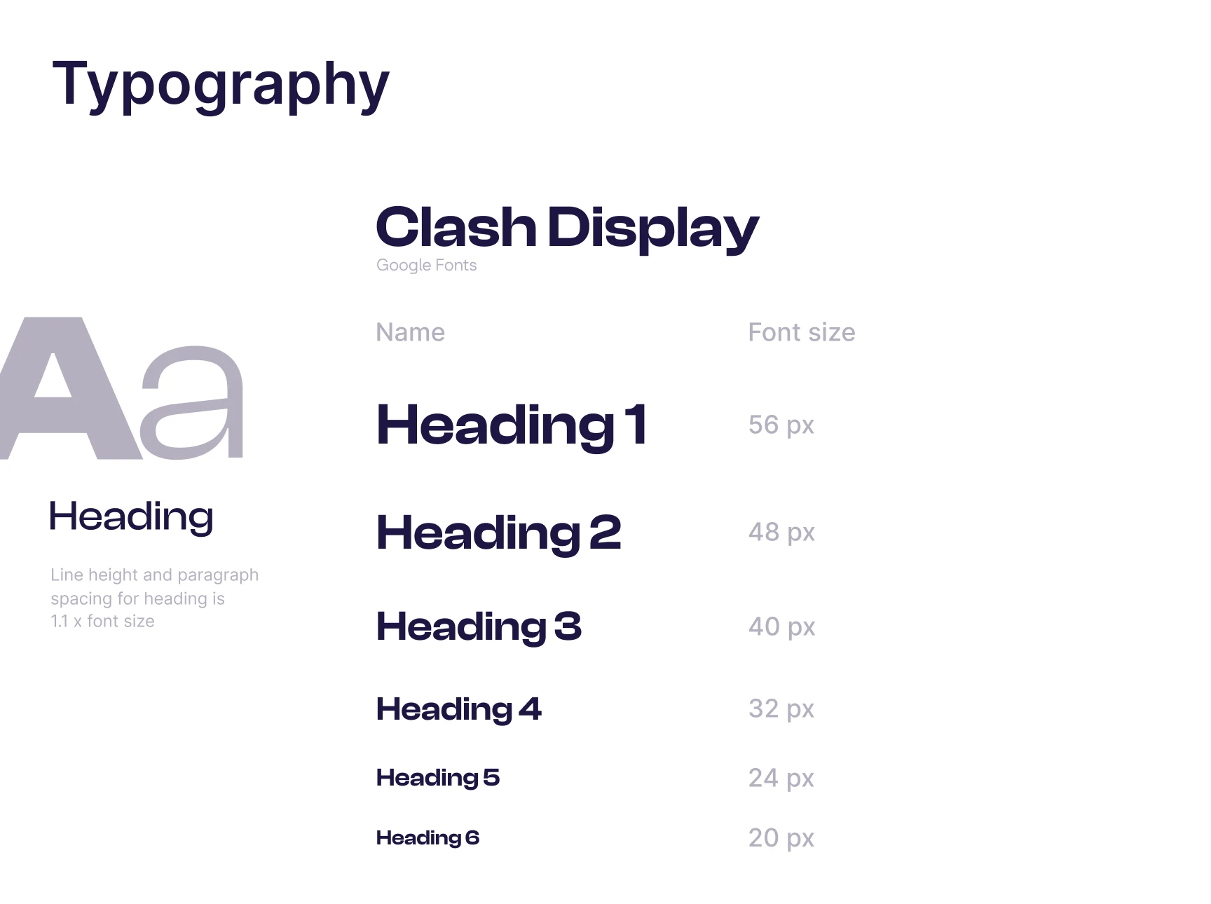
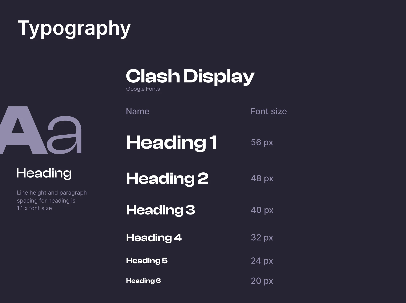
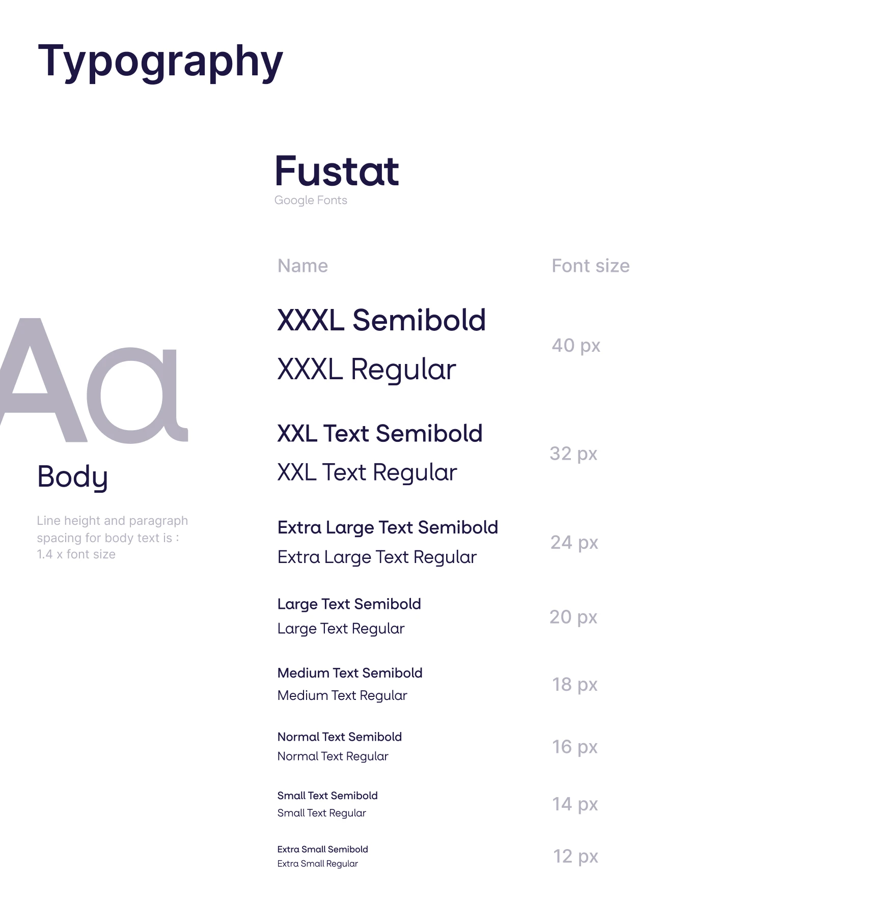
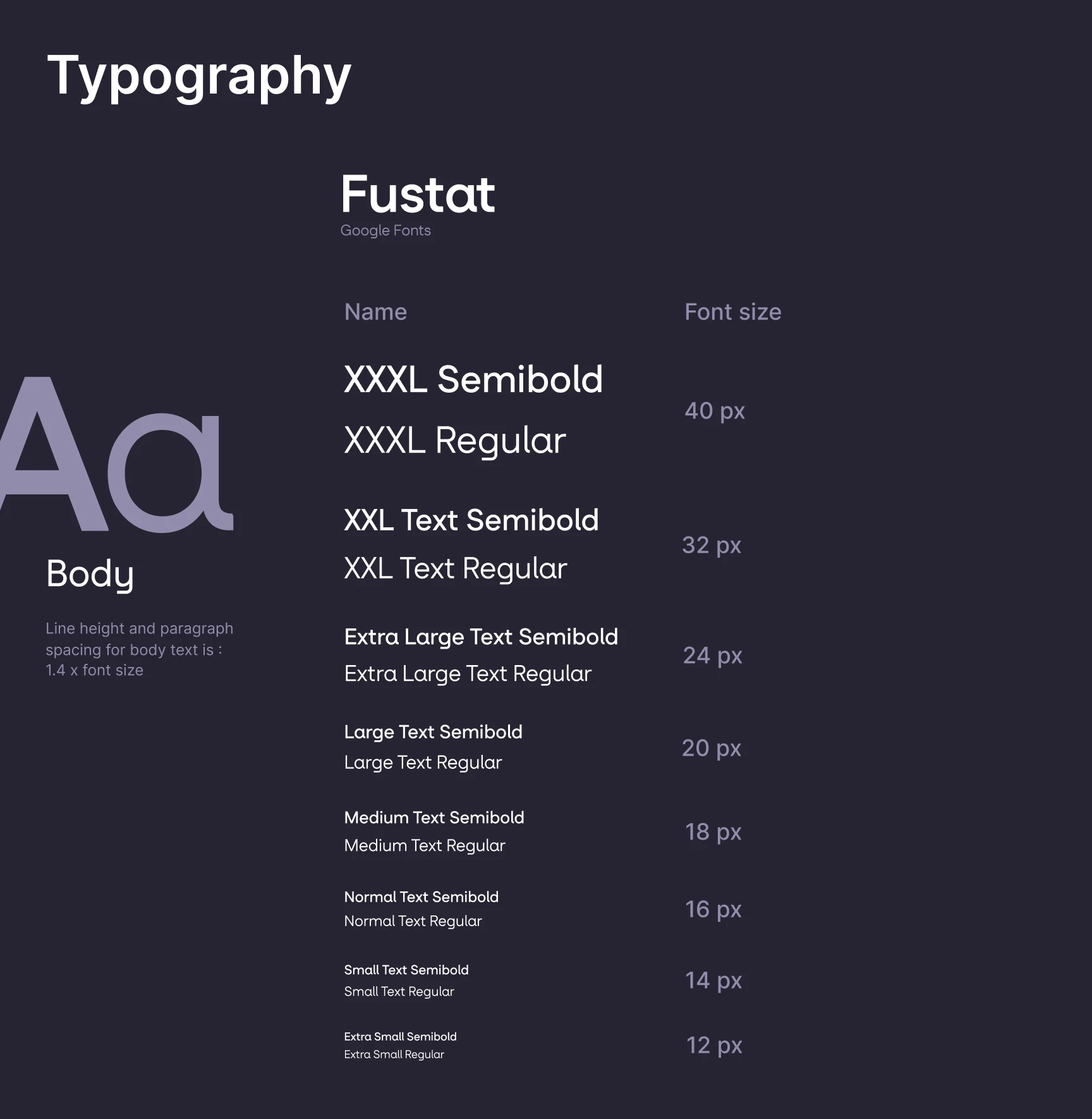
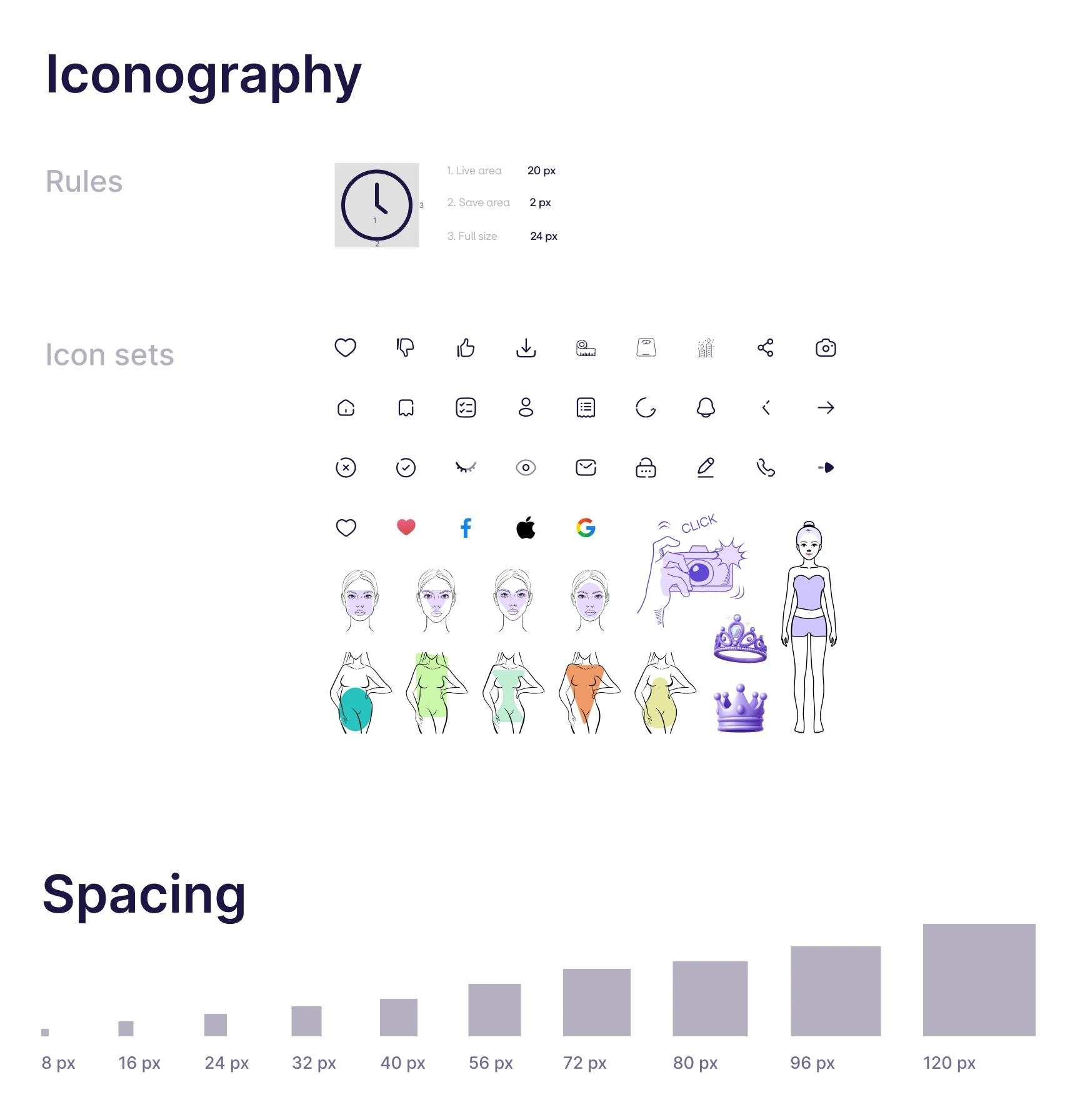
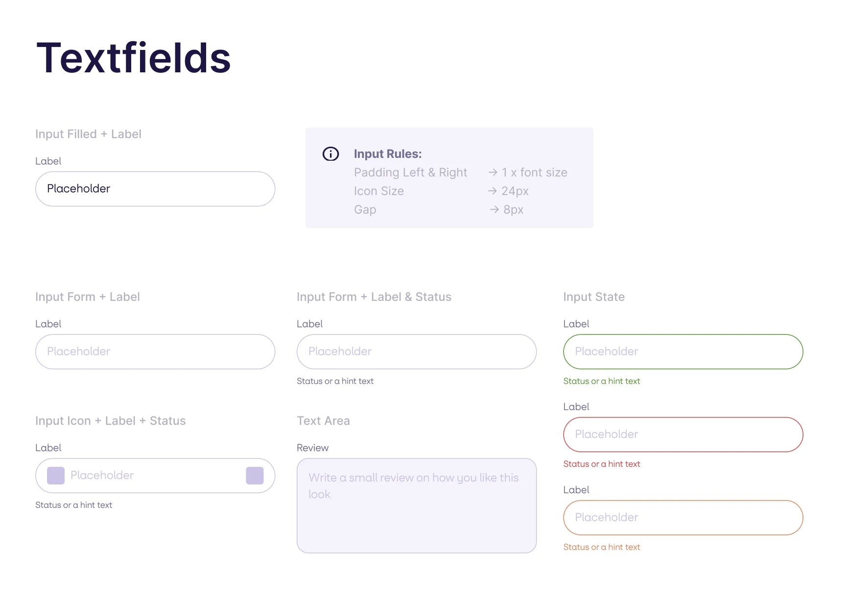
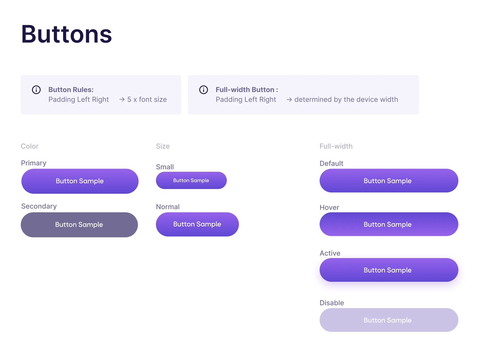
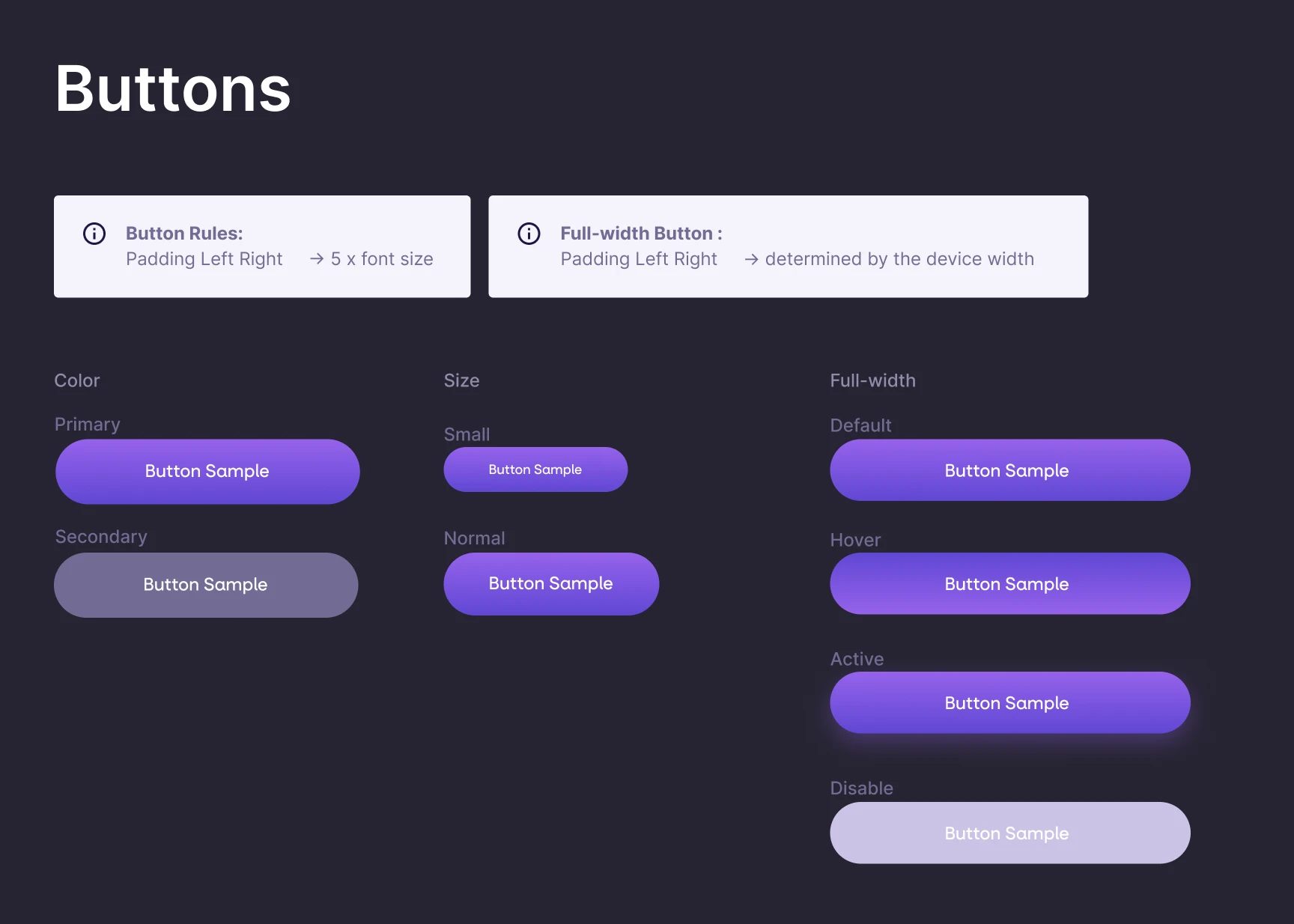
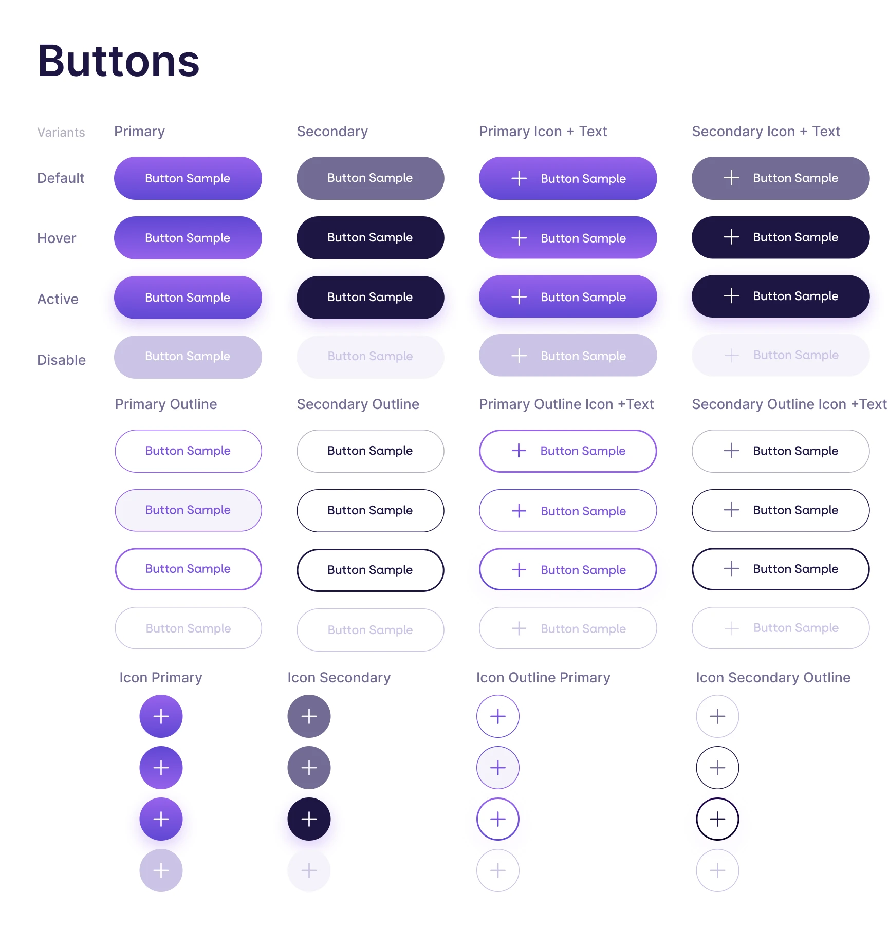
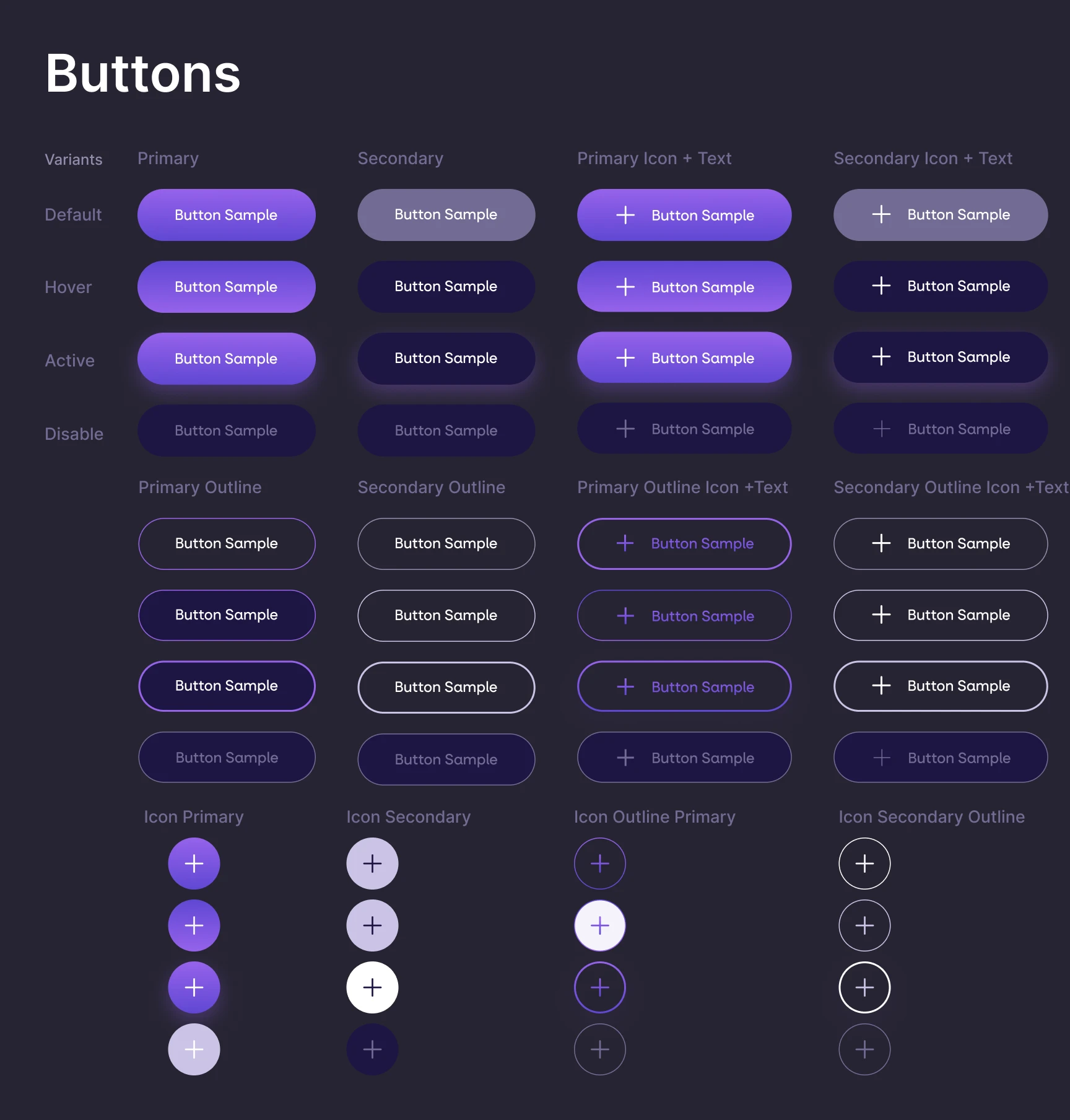
For the handoff to the developers, I created a style guide with six sections: colour, typography, iconography, spacing, text fields and buttons. I wrote the guidelines in terms of ratios, so that if a developer needs to scale a component, they don't have to ask.
What changed, counted from the files
Every number below can be checked against the Figma files.
Counted along the default email sign up and image based assessment. The new flow takes the default social sign up, adds six onboarding screens, and still gets there in 17. That's 40% lesser interations than before
Pieces of information collected before a result is shown, sign up included. The new path asks for four: an everyday vibe, a selfie, a full length photo, and consent to capture them.
The old app presented the subscription after 9 screens in the outfit flow. Now it comes right after the assessment.
There were 6 filters between the user and the outfit. I replaced them with "in progress", "partial", and "complete" states. The old flow had no such indicators.
What I recommended they do next
The client owned the analytics, so I set out what to measure and handed it over with the work: how long it takes from when someone first opens the app until they get my first suggestion, and also how long it takes to complete each part of the on-boarding and the assessment. I wanted to know where people are leaving the process, is it at a specific screen, or somewhere in the middle of the overall flow? And then there's the conversion rate at the screen where you choose a new plan, because essentially, this is the main part of the project.
I mentioned this at the time, not after the fact. We should also conduct user testing on the new on-boarding process with people who aren't connected to each other.
Improved time to value
By reducing friction during setup, users receive meaningful recommendations faster and with less effort. Read on median time to first recommendation.
Better feature discoverability
Important functionality is accessible when the users need it, without needing to search. Read on the share of activated users reaching wardrobe, saved looks and the attire switch.
Improved monetization flow
Subscription plans are introduced earlier, right after users experience personalized value. Tested as paywall view to trial start, against the old placement.
Stronger personalization
The connection between assessment answers and how they affect recommendations is visible throughout the app. Read on repeat sessions at day seven and day thirty.
This redesign wasn’t about adding any new features. Most of the platform's best features were already there. It was about making it easier for users to discover those features, understand them, and make it easier to use them. This particular project came the closest to my wish of doing a consumer UX project. I worked within the scope I had, and separated in my report what was evidence from what was design judgement.
What I would change about this project is its closure. I proposed a measurement plan and handed it over, but the engagement ended before the numbers came back. This is one project where formal UX research would have sharpened the work, and the shape of a freelance engagement is what stopped it. On the next one I am setting access to post launch data as part of the scope from the start.